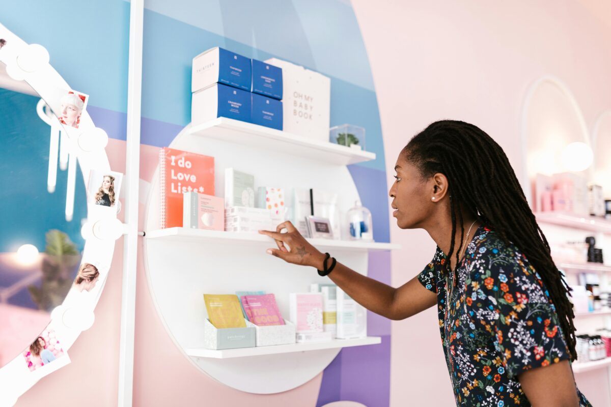
A well-designed box plays a powerful role in buying decisions because it shapes how customers perceive a product before they ever use it. Packaging communicates quality, value, and brand credibility at first glance, often influencing whether a customer feels confident enough to make a purchase. When a box looks thoughtful and premium, the product inside is automatically perceived as more desirable and worth the price. In many cases, customers don’t just buy the product; they buy the experience the packaging promises.
Imagine your product is speed-dating consumers. You don’t get five minutes to explain why they should choose you; you get about five seconds. In those few seconds, a customer decides whether to pick up your product or move on to the next one on the shelf. So how does a company win over a customer that quickly? Packaging — and nothing else.
But great packaging doesn’t happen by accident. It comes from understanding how design elements such as colour, typography, structure, and material influence customers’ perceptions of a product. These visual and physical cues work together to communicate what a product is, who it’s for, and why it’s worth choosing.
The Psychology of Colour in Custom Packaging
Colour is often the first interaction between your product and a potential customer. Before a label is even read, a consumer’s brain has already categorized your brand based on its palette. For businesses looking to stand out in the competitive Toronto retail market, choosing the right hue isn’t just about aesthetics—it’s about strategy.
For example, green suggests growth and sustainability, making it a staple for the eco-friendly packaging movement in Ontario. White communicates purity, while neutral “nude” tones feel calm and minimal. Studies show that consumers form subconscious judgments about products within seconds, and colour plays a major role in that process. When we assist clients with custom packaging design in Markham, we often see the “mismatch” trap. Imagine an all-natural facial lotion in a neon purple box. While it grabs attention, it creates a subtle sense of mismatch—the customer feels something is wrong. By sticking to whites and soft earth tones, a brand signals “natural” and “clean” instantly, meeting the customer’s expectations before they even pick up the bottle.
Shape and Structure
While colour draws attention, structure determines how customers interact with your product.
The physical shape of a package also plays a big role in grabbing attention. A uniquely shaped package can stand out on a crowded shelf and spark curiosity. However, creativity should never come at the expense of usability. A well-structured package not only improves usability but also increases the likelihood of purchase and repeat use.
Customers want packaging that is easy to open, comfortable to hold, and simple to store. If a design looks great but is frustrating to use, it can quickly become a negative experience.
Balancing creativity and practicality is key. While some brands experiment with unusual shapes, a well-designed standard box can still feel unique through thoughtful design details. Elements like custom illustrations, window cutouts that reveal the product inside, or functional cutouts that create handles or display features can add personality while keeping the structure practical.
Elevating the Senses: Materials and Premium Finishes
Once a customer picks up your box, the visual experience ends and the tactile one begins. This is where many buying decisions are finalized. In the world of luxury rigid boxes, the material you choose tells the story of your product’s quality.
We’ve seen a massive surge in the popularity of Soft-Touch Lamination across the GTA. This finish provides a velvety, matte feel that is synonymous with high-end luxury. It invites the customer to keep holding the box, increasing the “dwell time” with your brand. The longer a customer interacts with your packaging, the stronger the emotional connection becomes.
For brands targeting a more “raw” or artisanal demographic, uncoated materials provide a textured, organic feel that resonates with the environmentally conscious consumer. To truly make a mark, we recommend layering these materials with specialty techniques available at our Markham printing facility:
- Hot Foil Stamping: Adds a metallic shimmer (Gold, Silver, or Rose Gold) that screams “Premium.”
- Spot UV: Creates a high-gloss contrast against a matte background to make your logo pop.
- Embossing & Debossing: Adds a 3D physical dimension to your branding.
Bringing It All Together
All these elements — colour, structure, and materials — work together to shape how customers feel about your product before they even use it.
Creating the perfect packaging for a product can feel daunting, but it can also be an exciting and rewarding process. With every project, brands learn more about what resonates with their audience and what best represents their identity.
Your packaging is your most powerful silent salesperson. If it’s not helping customers choose your product within seconds, it may be time to rethink your design.
Whether you’re launching a new skincare line in Toronto or refreshing a luxury brand nationwide, the DY Printing Box team can help you create packaging that captures attention, builds trust, and turns first impressions into sales.